|
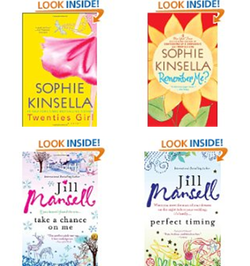
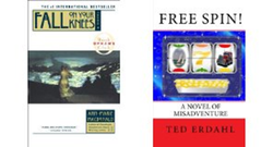
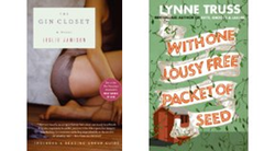
“Maybe we should bring back Fabio!” We were talking about book cover design, and the things that could be done to purchased stock photos to play off the book’s theme. It was clear that one male model in particular has seen a lot of use on book covers, not unlike Fabio did years ago. I imagine cover art was the last thing being talked about at most writer’s workshops ten years ago. At that point, for most authors, cover art assumed a publisher… with an art department and editorial staff to direct. Now, though, with epublishing and self-publishing trending, it has become part of the toolkit authors are expected to carry. The problem is… if other authors are like me, the last time they took a photo it was of the family on a Disney ride and the last time they actually drew something they were in primary school. It is a new skill we need to learn, and so we discuss it at meetings and take lots of notes at conference workshops. I would suggest, though, that while we may not be artists by trade, we are creative by nature. At the same time, most of us are prolific readers. So perhaps the very best thing we can do is analyze what is already out there. Below I have listed some examples of what I think might work for the type of writing I do. But here’s the thing…. Cover art is very genre specific. So go to Amazon, sort by type of writing, and look at those covers. That will be the best design teacher of all. The bottom line…. Just like Fabio was a model first and a business person second, authors also can prioritize writing and still ensure that their covers sell the wonderful words inside. Here are my top three cover design lessons...  1. If you write a specific genre/style, replicate basic elements on the cover to brand yourself. Sophie Kinsella and Jill Mansell do this extremely well I think. Look at how the font used for the name is consistent; and while the books are not series books, the graphic elements are similar enough that the author is represented without distracting from the content of the story.  2. White edging on ebooks does not work. White on white on white… enough said.  3. Bigger is better. Fonts for author name and book title should be large and bright enough to be clear when a reader is scanning the category list. I don’t love the cover for number two, but at least if I have read books by Lynne Truss I know this is one of hers.
1 Comment
4/23/2012 04:21:49 am
Excellent suggestions re; researching and creating strong covers. People DO buy books by their covers, so be sure yours is good (and, to the point above, reflects your brand and genre.)
Reply
Leave a Reply. |
Subscribe to my blog:
About Me...Deanne WilstedLink here to Betting Jessica on Amazon.com Archives
June 2020
Categories
All
|
 RSS Feed
